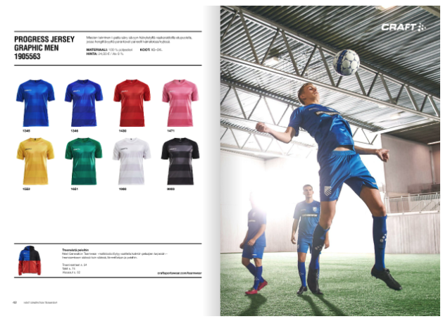
While we spend a lot of time talking about magazines here at the Joomag Blog, we wanted to take a moment to focus on another publication you can find in the Joomag Newsstand: digital catalogs. We brought together three examples that take this year’s trend of minimalism and put their own unique spin on them.
Keeping It Simple and Effective
Design doesn’t have to be complicated to sell your product. A lot of how you design your digital catalog should depend on what it is you’re selling. For example, we really like how simple and clean Craft Teamwear is with their catalog of sports apparel.
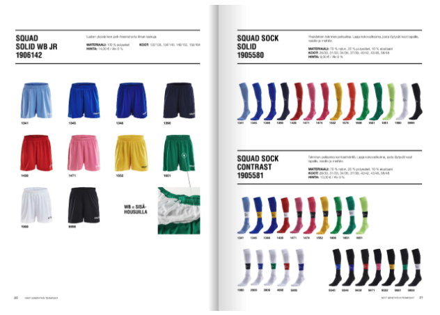
The use of plain black and white along with a bold but not distracting sans serif font for headers and descriptions allows for the colorful apparel to stand out and sell itself. There are also images of athletes using the apparel on sale scattered throughout the catalog. These shots are dynamic and engaging, a pleasant contrast next to the simple design of the content itself.
Taking It to the Next Level
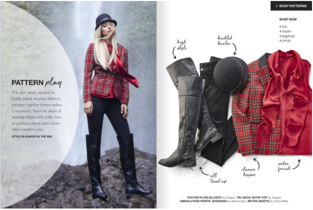
Stage’s fall 2016 lookbook looks like a fashion version of the more sporty Craft catalog: simple design that lets the elements on sale shine. They do mix things up by adding a playful handwritten font, but they otherwise stick to a simple sans serif and black and white design elements.
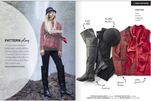
However, a closer looks reveals that they’ve flawlessly integrated one of our Crater Editor features without sacrificing design. Instead of cluttering up the text with links to wear you can buy the clothing featured here, all you need to do is hover over the piece of your choice to get a brief description of it and a link to where you can buy it. This isn’t just a lookbook anymore; it a direct pipeline to sales.
Maximize your potential
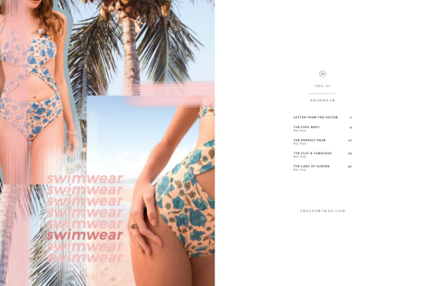
However, if you really want to make the most of the features of Crater Editor without coming at the expense of your design, then we’d like to suggest that you take a look at this summer’s Treefort magazine. (Yes, we know it’s not quite a catalog. But bear with us.) This swimwear issue’s use of Millennial Pink alongside minimalist black and white doesn’t make it just a summer issue, but a summer 2017 issue.
Maximize Your Potential
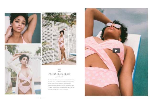
Treefort goes even further than Stage does, embedding videos and photo galleries to show this swimwear in action from every angle. It can be disappointing to buy a bathing suit based on seeing one picture of it online, only to find out later that it’s not a good fit. Treefort was able to give readers more without sacrificing their minimalist aesthetic.
Conclusion: The Power of Minimalism and Interactivity
FAQ
Q1: How does minimalism benefit digital catalogs in selling products?
A: Minimalist design allows products to shine without distractions. Brands like Craft Teamwear use simple layouts and clean typography to highlight their products effectively, making them stand out to potential buyers.
Q2: How can interactive features be integrated into digital catalogs without compromising design aesthetics?
A: Stage's fall 2016 lookbook demonstrates seamless integration of interactive features using Joomag's Crater Editor. With clickable links strategically placed within a minimalist layout, they provide direct paths for purchasing products, enhancing user experience while maintaining visual appeal.
Q3: How can brands maximize the potential of interactive features in their digital catalogs?
A: Treefort magazine shows how to leverage interactive features while preserving a minimalist aesthetic. By embedding videos and photo galleries, they offer comprehensive product information and enhance user engagement. Joomag's Crater Editor empowers brands to balance functionality and design, creating compelling digital catalogs that drive sales effortlessly.


