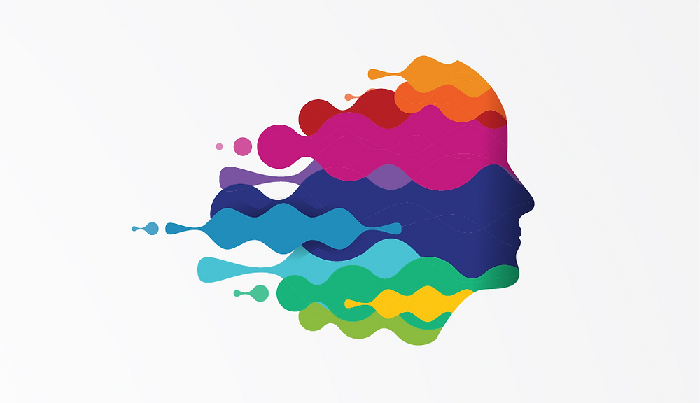
Color symbolism is a nonverbal way of communicating concepts and emotions. In desktop publishing, using color appropriately can set the stage before your audience reads a single word. It’s not enough just to pick your favorite colors; keep in mind how colors are perceived before you make your choices.
Warm Colors: Get Up and Go!
When looking for deeper meaning in colors, looking for where they’re found in nature is a great start. The red, orange, and yellow leaves of autumn bring to mind the changing of the seasons.

They can evoke warm or energetic feelings like love or excitement. Warm colors are also used to awaken hunger. Think about the logos of the fast food places you know. Think about their colors. Warm, right?
On the other hand, you should be careful. Warm colors can also represent danger. Fire is warm and comforting, but it can also be dangerous. Orange and yellow can overstimulate and exhaust audiences since they reflect the most light back to the eye.
Red is the warmest color, triggering strong emotions. Love and passion are associated with red, but so are anger and violence. As the color with the longest wavelength, it physically jumps out at you first. This makes red great as an accent color, but overpowering if used too heavy-handedly.
Orange, a mix of red and yellow, combines red’s strength with yellow’s energy. While it’s a warm color, it’s not as overpowering as red. It occupies an in the middle sort of space, which means it can be crisp and refreshing (think citrus fruits) or comfortingly warm (think of the sunset).
Yellow is closely associated with the sun, and sunlight is energy. It’s both a cheerful color and a great way to highlight information. However, overusing it can be like highlighting an entire textbook or being around someone who never takes anything seriously: annoying.
Cool Colors: Relax and Chill Out!
Let’s go back to nature and look for where we find cool colors. Green is the color of plants and growth, blue brings to mind the sea and sky, while finding purple is relatively rare when you think about it. Brought together, these are colors that calm and soothe the mind.

However, an overly cool color palette can come off as cold and impersonal. To preview how different proportions of warm and cool hues play together—and check contrast and accessibility—you can experiment with this color palette tester. Cool colors also appear smaller to the eye than warm ones, leaving them overpowered even if you use cool and warm colors in the same quantities.
Green is closely associated with plant life brings to mind growth and new beginnings. It’s great for creating an environmentally conscious aesthetic. Green is also a restful color, since it’s the easiest color for the retina to focus on. On the other hand, it can also be associated with envy and inexperience.
Blue calms the mind, as opposed to red’s aggressiveness or yellow’s boundless energy. Darker shades are often used in corporate designs to create a sense of trust and stability, but lighter shades are far friendlier. That makes lighter shades of blue an easy choice for social networks like Facebook and Twitter.
Purple is one of the rarest colors found in nature, which explains why it’s been associated with exclusive concepts like royalty. Since it’s made up of both red and blue, it balances their bold and calming qualities. This makes it a great choice for harmonizing a design.
Contexts like the cultures and experiences of your audience are important to keep in mind when playing with color symbolism. You might think yellow is a happy color, but in some cultures it’s used for mourning. While color can be used as a non-verbal language, not everyone “speaks” it in the same way.
FAQ
1. How does color symbolism impact communication in desktop publishing?
Color symbolism plays a crucial role in setting the tone and conveying emotions in desktop publishing. Before readers even engage with the text, colors can evoke specific concepts and feelings, influencing their initial perception of the content.
2. What are warm colors, and how do they affect audience perception?
Warm colors like red, orange, and yellow are associated with energy, excitement, and warmth. They can evoke emotions such as love and passion, but also danger and overstimulation if used excessively. Understanding the nuanced meanings of warm colors helps in creating engaging and impactful designs.
3. What about cool colors, and how do they differ from warm colors in communication?
Cool colors such as green, blue, and purple are known for their calming and soothing effects. While they can convey a sense of trust and stability, an overly cool color palette might appear distant or impersonal. Recognizing the characteristics of cool colors helps in crafting designs that resonate with the desired audience while avoiding misinterpretation.


