.png?width=44&height=44&name=joomag%20favicon-blue%20(2).png)
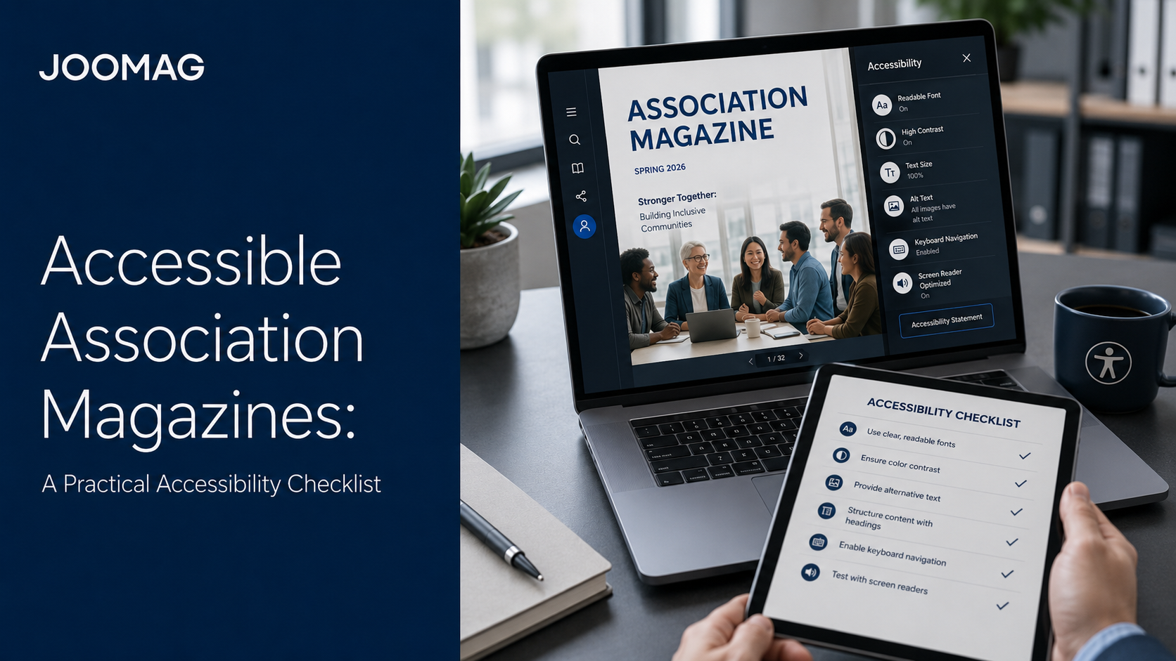
Association magazines are created to inform, educate, and connect professional communities. However, even excellent content loses value when some members cannot comfortably read, navigate, hear, or understand it.
A highly designed PDF may look impressive on a desktop screen but become difficult to use on a smartphone. A reader with low vision may be unable to enlarge the text without losing the intended reading order. A screen reader may encounter images without useful descriptions. A video interview may be inaccessible to a deaf or hard-of-hearing member because it has no captions.
Digital accessibility addresses these barriers.
An accessible association magazine gives more people a meaningful way to use the publication, including readers with visual, hearing, motor, cognitive, or temporary impairments. It also improves the experience for members reading on small screens, in bright environments, with slow connections, or in a second language.
Accessibility should not be treated as a technical correction added immediately before publication. It should be part of editorial planning, design, production, distribution, and quality assurance from the beginning.
This checklist explains how associations can create more inclusive digital magazines while preserving a strong visual identity and professional editorial experience.
What Does Accessibility Mean for an Association Magazine?
Digital accessibility means that people can perceive, navigate, understand, and interact with content using different devices and assistive technologies.
For an association magazine, this may include the ability to:
- Read content with a screen reader
- Navigate without using a mouse
- Enlarge text without losing information
- Understand images through alternative text
- Watch videos with captions
- Access audio content through transcripts
- Identify links and buttons clearly
- Complete forms with understandable labels
- Read articles comfortably on a smartphone
- Follow a logical heading and reading structure
Accessibility does not mean that every publication must look plain or identical. It means that design decisions should not prevent members from accessing the information.
A strong digital strategy can preserve the complete visual magazine while offering responsive and structured article versions for readers who need or prefer a simpler reading experience.
Why Accessibility Matters to Associations
Associations represent communities. Inclusive communication is therefore closely connected to their mission.
Making a membership magazine more accessible can help an organization:
- Reach more members
- Improve mobile reading
- Support older audiences
- Serve members using assistive technologies
- Strengthen trust and inclusion
- Reduce avoidable usability barriers
- Improve content structure
- Prepare for relevant accessibility requirements
- Make articles easier to search, share, and repurpose
Accessibility improvements often benefit everyone.
Clear headings make long articles easier to scan. Captions help members watching videos without sound. Descriptive links make navigation more predictable. Responsive text improves reading on smartphones. Transcripts allow readers to review an interview without playing the audio.
Understand the Legal Context
Accessibility requirements vary depending on the country, organization, audience, publication format, service, and business model.
In the European Union, the European Accessibility Act establishes requirements for specified products and services. Germany implemented these rules through the Barrierefreiheitsstärkungsgesetz, or BFSG, which has applied since June 28, 2025.
The covered areas include certain consumer-facing products and services, including e-books and related software.
This does not mean that every association magazine is automatically subject to exactly the same legal requirements. Applicability may depend on how the publication is classified, whether it is sold to consumers, whether it forms part of another digital service, and whether exemptions or separate regulations apply.
Associations should evaluate their specific situation with qualified accessibility and legal specialists. This article provides general publishing guidance, not legal advice.
Even when a particular magazine is not legally required to meet a specific standard, accessibility remains an important member-service and communication practice.
Follow the Four WCAG Principles
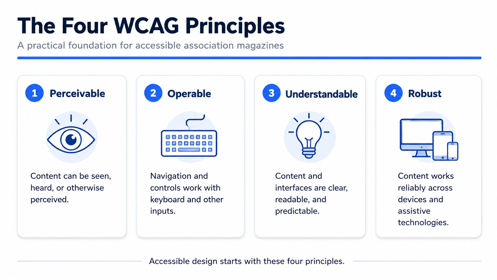
The Web Content Accessibility Guidelines organize digital accessibility around four main principles.
Content should be:
- Perceivable: Information must be available in ways users can see, hear, or otherwise perceive.
- Operable: Navigation and controls must work with different input methods, including a keyboard.
- Understandable: Content and interfaces should be clear, readable, consistent, and predictable.
- Robust: Content should work reliably across browsers, devices, and assistive technologies.
These principles provide a practical foundation for reviewing association magazines, responsive articles, multimedia, forms, and interactive advertising.
1. Do Not Rely on a Fixed-Layout PDF Alone
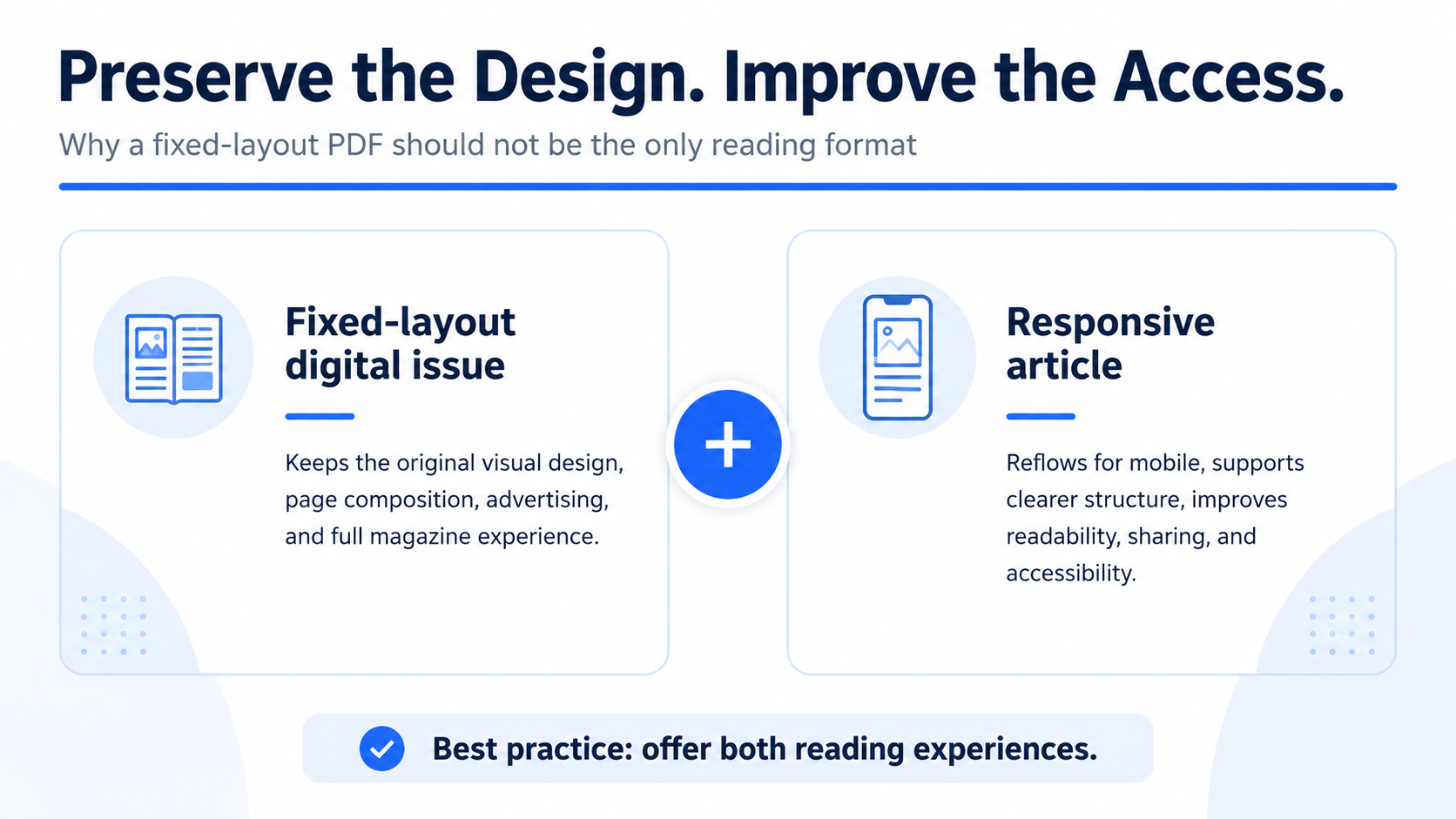
A PDF preserves the original magazine design, but it may create barriers when it is the only reading format.
Common problems include:
- Small text on mobile screens
- Repeated zooming and horizontal movement
- Incorrect reading order
- Missing heading structure
- Images without alternative text
- Difficult keyboard navigation
- Inconsistent screen-reader support
The solution does not have to be abandoning the designed publication.
Associations can offer the complete page-based magazine together with responsive HTML versions of important articles. Readers can choose between the traditional magazine experience and a clean, scrollable version that adapts to the screen.
This dual-format model preserves the publication’s visual character while improving mobile readability, accessibility, search visibility, and individual article sharing.
2. Create a Logical Heading Structure
Visual formatting alone does not communicate structure to assistive technology.
Each article should use:
- One clear main heading
- Descriptive section headings
- Properly nested subheadings
- Real numbered or bulleted lists
- Short and logically organized paragraphs
Headings should describe what the following section contains. They should not be chosen only because of their font size or visual appearance.
The reading order must also match the intended meaning. This is especially important when the original magazine contains several columns, sidebars, pull quotes, captions, and decorative elements.
When converting a magazine story into a responsive article, editors should verify that every element appears in a logical sequence.
3. Write Useful Alternative Text
Alternative text communicates the meaning or purpose of an image to readers who cannot see it.
Good alt text should be concise, specific, and relevant to the surrounding article.
Weak example:
Chart
Better example:
Bar chart showing membership growth from 2022 to 2026
A decorative image that adds no information may not need a spoken description. Charts, diagrams, event photographs, infographics, and screenshots usually require meaningful alternatives.
For complex data visualizations, summarize the main conclusion in the surrounding text and consider providing an accessible table or longer description.
Do not use file names such as image-04-final.jpg as alt text.
4. Use Strong Contrast and More Than Color
Text must remain readable against its background.
Low-contrast combinations, light gray body text, or text placed over busy photographs may be difficult for readers with low vision or color-vision differences.
Color should not be the only way information is communicated.
A chart should not identify categories only as red, green, and blue. Add direct labels, patterns, icons, or values.
Similarly, a form should not communicate an error only by changing the field border to red. Include a written explanation telling the reader what must be corrected.
Contrast should be checked during design, not only after the magazine has been completed.
5. Use Readable and Flexible Typography
Magazine designers often work with precise fixed-page layouts. Digital readers need greater flexibility.
Use:
- Comfortable body-text sizes
- Adequate line spacing
- Clear paragraph spacing
- Reasonable line lengths
- Legible fonts
- Limited all-capital text
- Clear differences between headings and body copy
Readers should be able to zoom or enlarge text without losing content or functionality.
Responsive articles are useful because the text can adapt to the device rather than remaining locked inside a printed page size.
6. Support Keyboard Navigation
Some readers navigate without a mouse. They may use a keyboard, voice control, switch device, or other assistive technology.
Test whether a reader can:
- Move through links and buttons logically
- Open and close menus
- Activate video controls
- Complete forms
- Close pop-ups
- Navigate between pages
- Return to the previous section
- Identify which element currently has focus
Visible keyboard focus is essential. Readers should always be able to see which button, link, form field, or control is currently selected.
Interactive advertisements, Sticky Banners, and Automatic Pop-ups must also be tested. They should not trap keyboard focus, hide essential content, or prevent the reader from continuing.
7. Use Descriptive Links and Buttons
Links such as “click here” or “learn more” provide little context when read outside the surrounding paragraph.
Instead of:
Click here
Use:
Download the 2026 membership report
Instead of:
Learn more
Use:
Explore the association’s professional training program
The wording should explain where the link leads or what action will happen.
Buttons and linked areas should also be large enough to activate comfortably on a touchscreen. Several small links should not be positioned so closely that users may select the wrong one.
8. Add Captions and Transcripts
Videos, podcasts, interviews, and audio messages can make an association magazine more engaging, but they also require accessible alternatives.
Provide:
- Accurate captions for spoken video content
- Transcripts for podcasts and audio interviews
- Descriptions of essential visual information when necessary
- Controls for play, pause, volume, and replay
- A way to stop automatically moving or playing content
Captions benefit more than deaf and hard-of-hearing readers. They also help members watching in an office, on public transport, or in a language they do not speak fluently.
Avoid forcing audio to play automatically. Unexpected sound can be disruptive and may interfere with assistive technologies.
9. Make Data and Tables Understandable
Associations frequently publish research, benchmarks, surveys, and industry statistics.
Tables should use real row and column headers rather than visual spacing alone. Keep their structure as simple as possible and explain abbreviations.
Charts should include:
- Clear titles
- Direct labels
- Readable legends
- Sufficient contrast
- Values that do not depend only on color
- A written summary of the main finding
Readers should not need to interpret a complex visual to understand the article’s essential conclusion.
When appropriate, provide the underlying data in an accessible table or downloadable format.
10. Design Accessible Forms and Interactive Content
Digital association magazines may include surveys, event registration, membership forms, polls, sponsor inquiries, and calls to action.
Every field needs a clear label. Instructions and error messages should explain what the user needs to do.
Avoid using placeholder text as the only label because it disappears when a reader begins typing.
Interactive elements should:
- Work with a keyboard
- Have clear names
- Provide visible feedback
- Avoid unexpected changes
- Allow sufficient time
- Be easy to close or cancel
- Avoid covering essential content
Accessibility testing should include embedded forms, quizzes, sponsor advertisements, Sticky Banners, and Automatic Pop-ups.
11. Prioritize Mobile Reflow
Many members will open the magazine through an email or social-media link on their phone.
A fixed desktop-oriented page may force them to zoom, move horizontally, and search for the correct reading order.
Responsive articles allow text, images, and interactive elements to reflow according to screen size.
On mobile devices, review:
- Text size
- Line length
- Button size
- Space between links
- Image scaling
- Table behavior
- Form usability
- Banner placement
- Pop-up size and close controls
- Portrait and landscape orientation
Mobile accessibility and general mobile usability are closely connected. Improvements made for one usually benefit the other.
12. Test With Several Methods
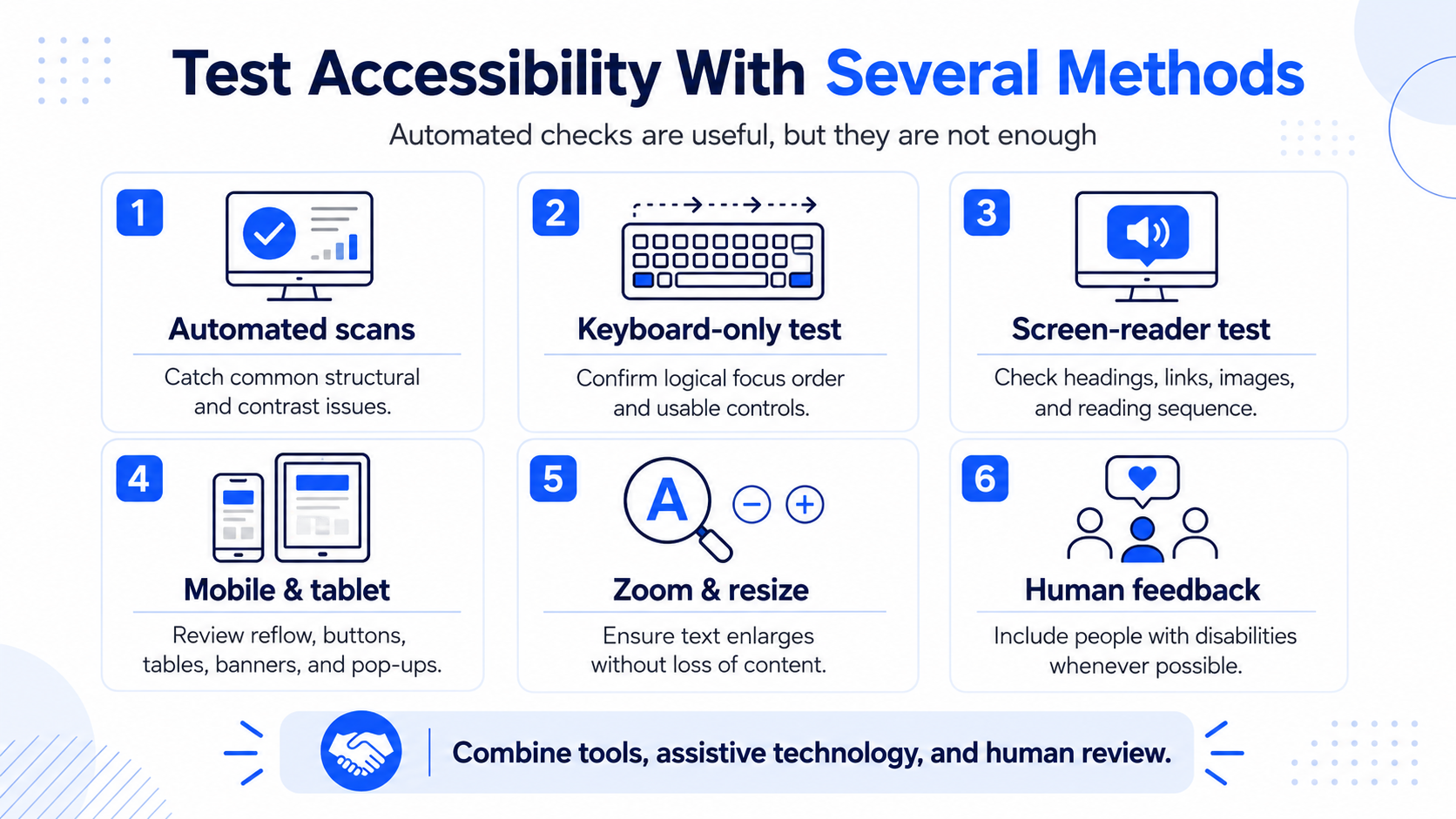
Automated accessibility checkers are useful, but they cannot identify every problem.
A practical testing process should combine:
- Automated accessibility scans
- Keyboard-only navigation
- Screen-reader testing
- Smartphone and tablet testing
- Zoom and text-resizing checks
- Contrast checks
- Heading and reading-order reviews
- Caption and transcript reviews
- Feedback from people with disabilities when possible
Test representative articles, templates, advertisements, forms, videos, and navigation controls.
Accessibility is not a one-time pass-or-fail project. Publications change, templates evolve, and new interactive features are introduced. Testing should therefore become a regular part of the publishing workflow.
Build Accessibility Into the Workflow
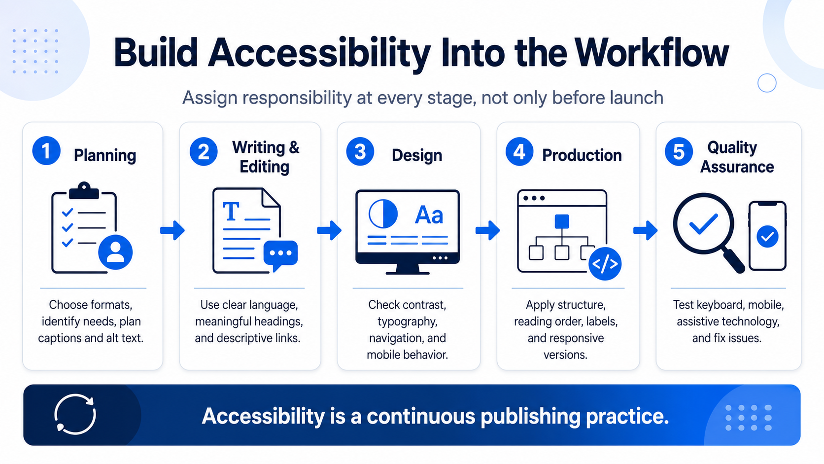
The most efficient approach is to assign accessibility responsibilities at every stage.
Planning
- Define the audience and possible access needs
- Choose formats that support responsive reading
- Plan captions, transcripts, and image descriptions
- Identify relevant requirements
Writing and editing
- Use clear language
- Create meaningful headings
- Write descriptive links
- Explain charts and complex visuals
- Prepare alt text
Design
- Check contrast
- Use readable typography
- Avoid color-only meaning
- Create clear navigation
- Design for mobile devices
Production
- Apply semantic structure
- Verify reading order
- Add captions and transcripts
- Label forms and controls
- Create responsive article versions
Quality assurance
- Run automated checks
- Navigate with a keyboard
- Test mobile devices
- Review with assistive technology
- Correct issues before launch
This process is more reliable than asking one person to make the complete publication accessible immediately before it goes live.
How Joomag Supports More Accessible Association Magazines
Joomag allows associations to preserve a high-design digital edition while providing additional ways to consume the content.
AI Article Extraction and Article Studio can transform PDF stories into responsive HTML articles that adapt to different screen sizes. Editors can review the structure, images, links, formatting, and accessibility details before publication.
Joomag also supports text-only publication content and keyboard-based navigation in the publication viewer.
A practical workflow can include:
- Upload or create the complete designed magazine.
- Preserve the classic page-based publication experience.
- Extract important stories into responsive articles.
- Review headings, reading order, images, and links.
- Add alternative text and accessible multimedia.
- Test keyboard and mobile navigation.
- Publish both reading options.
- Use analytics and Joom Agent to understand how audiences use the different formats.
Joom Agent can help teams compare content performance, identify engagement patterns, and understand which formats members prefer. It should not be used as an accessibility compliance checker.
Technology can remove many barriers, but no platform replaces editorial review, testing, and responsibility for the final content.
Conclusion
An accessible association magazine is not a less attractive or simplified publication.
It is a magazine that gives more members a reliable way to access valuable information.
The strongest approach combines a visually rich digital edition with structured, responsive articles and an accessibility-focused editorial workflow.
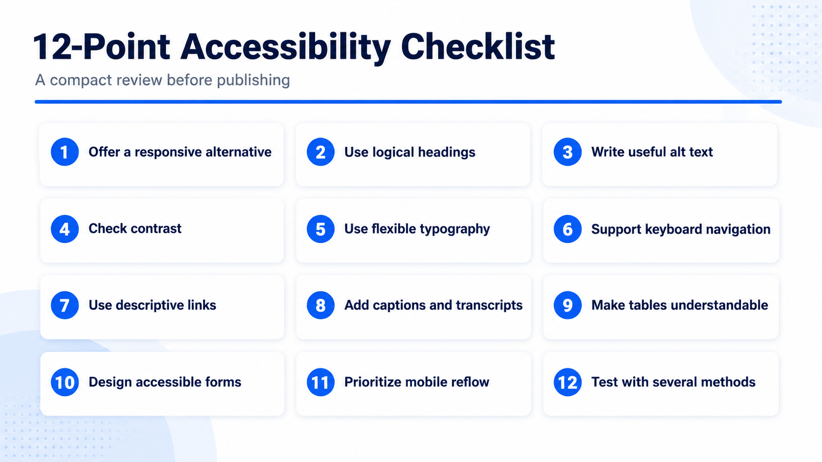
Associations should prioritize:
- Alternative reading formats
- Logical headings and reading order
- Useful alt text
- Strong contrast
- Flexible typography
- Keyboard navigation
- Descriptive links
- Captions and transcripts
- Accessible tables and charts
- Usable interactive elements
- Mobile reflow
- Regular testing
Accessibility improves inclusion, mobile usability, content quality, and member experience. It also helps associations prepare for a digital environment in which accessible communication is increasingly expected.
Ready to make your association magazine more accessible without losing its visual identity? Book a Joomag demo.
FAQ
Does every association magazine have to comply with the BFSG?
Not necessarily. Applicability depends on the publication, service, audience, organization, and business model. Associations should obtain advice based on their particular situation.
Is a PDF automatically accessible?
No. A PDF may require correct tagging, reading order, headings, alternative text, keyboard support, and additional accessibility work.
What are the four WCAG principles?
WCAG organizes accessibility around content being perceivable, operable, understandable, and robust.
Can an association keep its existing magazine design?
Yes. The complete designed edition can remain available while responsive article versions provide an alternative reading experience.
Are automated accessibility checkers enough?
No. Automated tools should be combined with keyboard testing, assistive-technology checks, mobile review, and human evaluation.
How does Joomag support accessibility?
Joomag supports responsive Article View, accessibility information for article images, text-only publication content, keyboard navigation, and multiple reading formats. The publishing team must still review and test the final content.