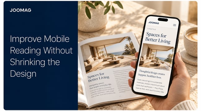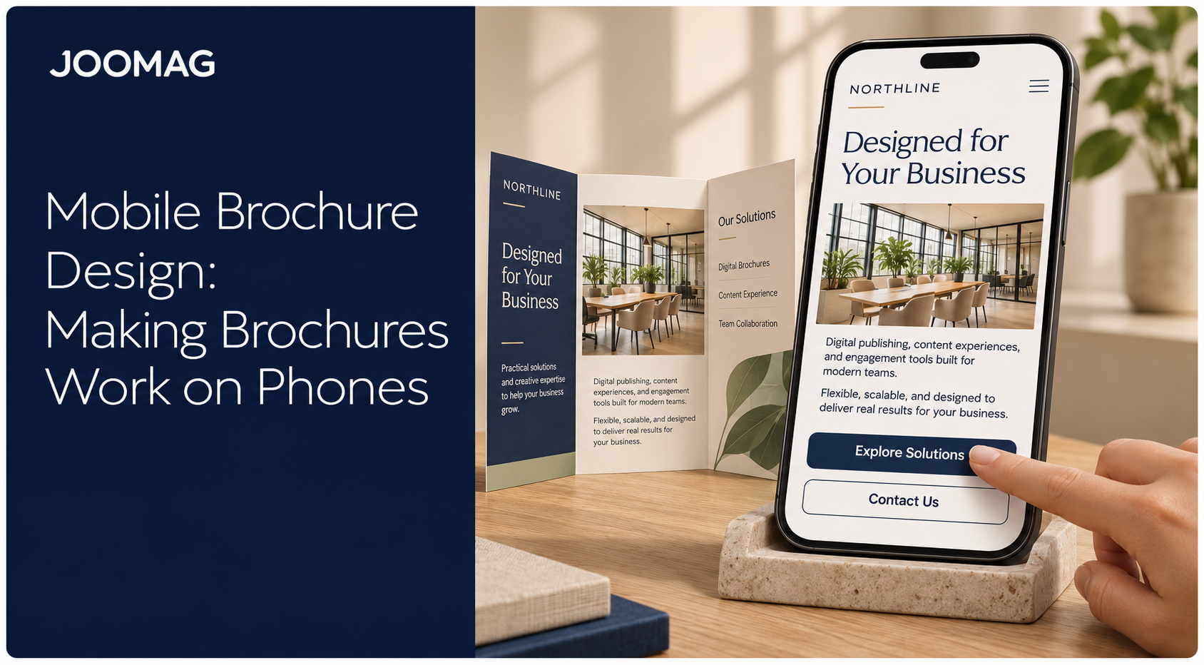
A sales email lands while someone is still on the train. The attachment is the brochure your team built for A4 or US Letter, and the prospect opens it on a phone between stops. They pinch, they pan, and they leave before the offer. Mobile brochure design starts from that moment. Shrinking the print page doesn't make it readable. A phone version has to work as a structured document: type that reflows, a reading order a screen reader can follow, controls a thumb can hit, and images light enough for a cellular connection.
Why a Shrunk Print Brochure Fails on Phones
Picture the handoff. A sales rep forwards the finished A4 file. The prospect opens it on a screen about 390 pixels wide, one hand on a rail, the other on the phone. Nothing in that layout was composed for a thumb.
| Print format | Approx. scale |
|---|---|
| A4 (about 794 px wide at 96 dpi) | about 49% |
| US Letter (816 px wide) | about 48% |
Fitted to that phone, both pages land near half size. Say the body copy is 10 pt in print. At roughly half scale it sits near 6.5 pixels. Readers pinch to make a sentence legible, then drag sideways to chase a second column and its caption. The page costs effort before any claim lands.
The assumptions that produce this are the print ones. Fixed multi-column grids, type laid over photographs, small hotspots, and links crammed into a footer panel all survive the export and fail on the phone.
Most production notes stop at columns and compression. They skip screen readers, magnification, keyboard use, and mobile text-to-speech. Adobe's guide to accessible PDFs treats a usable file as a structured document: searchable text, correctly tagged headings, a logical reading order, descriptive alternative text, accessible links, and working form fields. That structure is what lets copy reflow into larger type and a single column, instead of forcing zoom and pan across a fixed page. Dropping a print PDF into a responsive viewer doesn't repair image-based text or a scrambled order. The gap reaches customers, employees, and procurement reviewers, and some policies require an accessible alternative.
Open the file at phone width and count the taps it takes to read one paragraph. More than a couple means you still have a smaller copy of the page, not a phone version that reflows.
Choosing Between a PDF, Flipbook or Responsive Layer
| Format | Best for | Phone reading | Accessibility | Upkeep |
|---|---|---|---|---|
| Traditional PDF | Exact print replicas, regulated wording | Fixed page with pinch and zoom | Depends on tagging | Low effort, but no reflow |
| Mobile-optimized PDF or flipbook | Sales reviews, catalogues with fixed pages | Larger pages, linked navigation | Depends on tags and alt text | Medium, files re-exported on change |
| Responsive digital article | Phone comprehension, CTAs, itineraries, sales briefs | Single-column reflow | Strongest when built with structure | Higher at setup, easier to edit |
The traditional PDF keeps exact print geometry. Pagination, regulated wording, and executive sign-off stay intact. On a phone it stays hard to read, because columns, captions, and links were composed for a large canvas. Enlarging a page means repeated pinch-and-zoom and panning.
A mobile-optimized PDF or flipbook keeps that composition and improves the file. Larger pages, a linked table of contents, embedded navigation, and a smaller download suit sales reviews and catalogues where the spread still has to look like the approved piece. It doesn't reflow body copy into a column a thumb can scroll.
A responsive digital article goes further. Text becomes one column, blocks get shorter, images resize, calls to action move into the reading path, and navigation changes for touch. That's the format for comprehension and action, not for an exact page match. Teams that publish both usually build them from one source, then deliver each version through a digital publication workflow rather than emailing a single heavy PDF.
Which brochure type gets which format
Product brochures. Specification tables reflow into a label-and-value stack so a buyer can compare on a phone. Offer the full-colour catalogue as a separate download for people who want the designed spreads.
Sales brochures. A responsive brief carries one call to action per section, with a clear path to a demo or a proposal. A fixed flipbook can still sit behind it for the leave-behind the account team already signed off.
Travel brochures. Itineraries and maps belong in the mobile layer, with tap-to-call and booking links at the moment the reader decides. A designed map spread can remain a downloadable page for people who want the poster view.
Corporate brochures. The annual piece stays a fixed design file when the boardroom, the printer, or regulated wording needs page-for-page equivalence. Employees and investors on phones get a responsive summary of the same facts.
The rule: Keep the original when exact print equivalence is central. Build a reading layer when phone comprehension and action matter most. Many teams need both.
Typography and Layout Rules for Small Screens
Body text should be at least 16 px, and 16 to 18 px is the working range. Below that floor, people zoom before they read, and every later layout decision fights that first pinch. The mobile reading experience only works when the first screen is already legible.
| Element | Print default | Mobile value | Why it changes |
|---|---|---|---|
| Body text | 9-10 pt | 16-18 px | Smaller text forces pinch-to-zoom |
| Line length | 70-90 characters | 35-45 characters | Short lines are easier to track while scrolling |
| Line spacing | Near 1.0 to 1.15 | 1.4 to 1.6 | More space between lines helps reflowed text |
| Columns | 2-3 | 1 | A single column reflows without panning |
| Content block | Full-page paragraphs | 3-4 lines per block | Short blocks fit one screen |
| Heading levels | 3-4 styles | 2-3 styles | Fewer levels keep hierarchy clear at narrow width |
Print line length of 70 to 90 characters is comfortable on paper and exhausting on a phone. Cut it to 35 to 45 characters so the eye can finish a line without losing the next one while the page scrolls. Open the line spacing to 1.4 to 1.6. Reflowed text set tight looks like a grey slab.
Blocks, headings, and pictures
Break paragraphs into three or four lines, one idea per block. Put a subhead in front of any block a scanner might skip. Use two or three heading levels only, with a clear step in size and weight. Four print styles collapse into noise at a narrow width.
A three-column product specification is the usual before. After, it's one column: a bold label, then the value, then the next label. Readers compare without sliding the page sideways.
Keep text off photographs unless it's a short caption underneath. Type on a photo fails contrast as soon as the crop changes, and it can't reflow.
Read the first screen without zooming. If you can't find the main heading within two seconds, the hierarchy is failing. Fix size and weight before you touch colour.
Touch Targets, Contrast and Reading Order Minimums
The failure that shows up first is a row of tiny arrows or footer links. Readers miss, hit the neighbour, and lose the page they meant to open.
W3C mobile accessibility guidance on touch targets sets a minimum of 9 mm by 9 mm, regardless of screen size, device, or resolution, and at least 9 mm centre to centre between neighbouring targets. Page arrows, contents links, form controls, map markers, and CTA buttons all fall under that rule. Shrinking the A4 or Letter page and hoping for accurate taps doesn't meet it.
| Check | Minimum | Enhanced level | Applies to |
|---|---|---|---|
| Touch target size | 9 mm by 9 mm | None defined | Page arrows, links, form fields, CTA buttons |
| Target spacing | 9 mm centre to centre | None defined | Adjacent links and hotspots |
| Normal text contrast | 4.5:1 | 7:1 | Body copy, captions, links |
| Large text contrast | 3:1 | 4.5:1 | Headings and large callouts |
The same guidance sets WCAG Level AA contrast at 4.5:1 for normal text and 3:1 for large-scale text. Enhanced contrast raises those to 7:1 and 4.5:1. Print palettes break these often: pale grey captions, light type over a photo, thin faces on a tinted panel. Recalculate contrast in the mobile layer. Don't edit the print file to chase a phone ratio and then watch the printed piece go muddy.
Order, labels, and one action
Tag headings in a real sequence. Give informative images alternative text that says what the picture shows, not "image". Write link labels that make sense alone. "Request a quote" works out of context. "Click here" doesn't.
Never carry status by colour alone, and never put two competing calls to action on the same screen.
A red dot next to a green one means nothing to someone who doesn't see that difference. A second button next to the primary one splits the tap. One action, large enough, with space around it.
Image and Load Speed Choices That Keep Readers
Images are often the largest component of a phone reading experience. The HTTP Archive's 2025 Web Almanac page weight chapter reported a median mobile homepage of about 2.56 MB, with images accounting for roughly 911 KB. At the 90th percentile, mobile homepages used 6,288 KB of images. A brochure with several full-resolution photographs can do worse and still look faithful in print. On a cellular connection it opens late.
Keep, shrink, or defer
Keep the picture that carries the message: the product in use, the destination, or the one chart an executive needs. Shrink photographs and export illustrations in an efficient format, downsampled to display size, about 150 ppi for the phone version against 300 ppi for print. Defer galleries. Load the hero on the first screen and bring product, destination, or detail images in as the reader scrolls.
Cut repeated decorative photos, autoplay video, and oversized embedded PDFs. Limit the file to two font families and subset them when the tool allows. Export with fonts embedded and tags intact, and keep text live. Flattening paragraphs into images makes them both heavy and unreadable to assistive tech.
Interactivity should earn its weight. A hotspot that opens one labelled detail, and that a keyboard can reach, is enough. Animation on the first screen is not.
An immersive catalogue can hold a casual reader longer and still lose a high-intent prospect before the form appears.
If the first useful content is slow on a mid-range phone, remove the least useful image first. Then test again. Don't add another effect to hide the wait.
How to Build a Mobile Brochure Step by Step
Build in this order. Teams that convert the print file first and name the goal last end up with a layout that serves the old page.
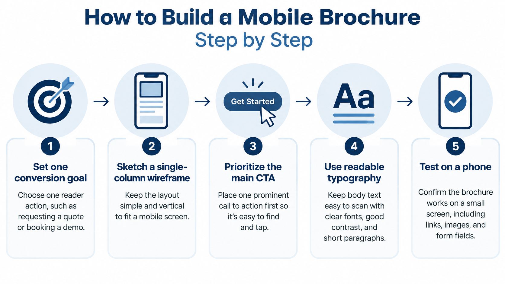
- Set one conversion goal and one audience task. Write a single sentence that names the reader's action, such as requesting a quote or booking a demo. Every later choice either supports that sentence or comes out.
- Sketch a single-column, thumb-friendly wireframe. Primary actions sit in the lower middle of the screen, not in the top corners, where a one-handed grip can't reach them cleanly.
- Put the value proposition and the main CTA in the first viewport. That's the first screen before any scroll. A button on page four of a print brochure is seldom reached on a phone.
- Rebuild the content, then the images. Rewrite long print paragraphs into short blocks, move type off pictures, and add alt text to informative images. Compress imagery so the first screen can render while lower images wait.
- Test on at least one iOS device and one Android device on a cellular connection. Office Wi-Fi hides the failure your prospect will hit on the train.
- Measure completion, CTA taps, form starts, exits, and load time by device. A richer file that delays the first useful tap can lose to a simpler one. This step is how you see that.
Google's mobile site speed playbook found that 70% of mobile landing pages took more than five seconds to display above-the-fold visual content, and that the probability of bouncing increased by 123% as load time rose from one to ten seconds. A SOASTA study cited there found pages loading one second faster achieved up to a 27% increase in conversion rates, while average bounce rates rose from 13% for loads under three seconds to nearly 60% after nine seconds. Treat speed as a design constraint. Use a lightweight hero, skip autoplay and embedded print PDFs, render only the first screen immediately, and report fast and slow networks separately.
The online editor is where that rebuilt column, the first-screen CTA, and the deferred images get assembled without going back to the print artboard for every sentence change.
Run the Phone Check Before You Publish
Run this gate before any brochure goes live. Visual polish comes after the checks, not before.
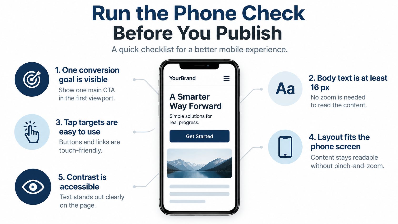
W3C's note on how WCAG 2.0 and UAAG 2.0 apply to mobile asks for a logical reading order, meaningful alternative text, keyboard- and screen-reader-accessible hotspots and CTAs, at least a 4.5:1 contrast ratio for normal text and 3:1 for large text, and touch targets of at least 9 mm by 9 mm with separation from neighbours. Don't pack adjacent links into one panel, and don't communicate meaning through colour alone.
- One goal, first screen. One conversion goal and one main CTA are visible before any scroll.
- Type. Body text is at least 16 px, and the first screen can be read without zooming.
- Column and targets. The layout is a single column, with tap targets and clearance that meet the sizes above.
- Contrast. Normal text passes 4.5:1 and large text passes 3:1.
- Structure. Headings are tagged, informative images have alt text, and every link label makes sense out of context.
- Assistive check. Reading order is verified with a screen reader and a keyboard.
- Weight. Images are compressed, and everything below the first screen is deferred.
- Connection. The first screen loads promptly on cellular, not only on office Wi-Fi.
- Devices. Check one iOS phone and one Android phone, including portrait, large text, and one-handed use.
Open the file on two phones, one a mid-range device on 4G, and time the first screen. Log defects by severity and retest after every template change. Common slips are a print PDF left in its old reading order, text baked into images, tiny hotspot icons, and several CTAs on one screen.
Build an accessible master template so later brochures inherit the rules. In our Creative Studio, teams design, import PDFs, add interactive elements, and adapt the same content for mobile from that master instead of repairing each file after it ships.
This week, run the gate on the first page of one live brochure. Log each failure by severity, and fix the worst one before the next send.
Joomag helps marketing and communications teams turn print and desktop PDFs into brochures people can read and act on from a phone, with structure, interaction, and mobile layout in the same workflow. If your current file still needs a pinch before the offer appears, see how we handle creation and delivery. Visit Joomag to request a live demo and walk through one of your own brochures.