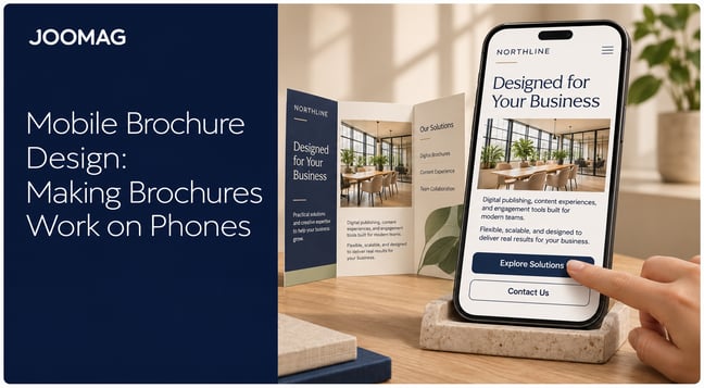
You've just approved a polished catalog, report, or sales proposal. It looks sharp on your monitor and prints beautifully. Then a prospect opens it on a phone between meetings, pinches to enlarge the first paragraph, swipes sideways across a pricing table, and closes it before reaching your offer. The design isn't the problem. The problem is asking a fixed page to behave like a phone screen. You can make a PDF mobile friendly without rebuilding every spread, as long as you fix the reading path instead of only shrinking the file.
Why Page-Sized PDFs Fail on Phones
Try a simple test before you change anything. Open the PDF on your phone in portrait, read one full paragraph, and count every pinch, pan, and sideways swipe. If you need more than one adjustment to finish a short passage, readers who are less committed than you will probably stop sooner.
Most designed PDFs are built around a fixed page such as A4 or US Letter. A phone either scales that entire page down to fit its width or shows only part of it at a readable size. Body text that looked comfortable in print becomes tiny, while two-column articles, sidebars, pull quotes, and wide tables push content outside the visible area.
The Failure Is Structural
Visual size is only part of the issue. A PDF can place text boxes anywhere on a page, but that placement doesn't tell a phone viewer which block comes first. Without reliable tags, reading order, and bookmarks, reflow tools may jump from a headline to a caption or read across two columns as if they were one line.
That disconnect became harder to ignore when Google launched its mobile-friendly ranking update on April 21, 2015, giving a mobile search ranking benefit to pages that were legible and usable on mobile devices. Pages requiring horizontal scrolling or excessive zooming were disadvantaged. Google targeted web pages rather than PDFs specifically, but the publishing lesson is direct. If readers discover and read your work on phones, mobile usability affects reach.
| Symptom | Cause on a phone | What the reader does |
|---|---|---|
| Text too small to read | Fixed page scaled down to phone width | Pinches to zoom on every page |
| Constant pinch and zoom | Single-page fit ignores screen width | Pans around each page to follow a line |
| Horizontal scrolling | Multi-column spreads or wide tables wider than the screen | Swipes sideways across columns |
| Hard to navigate | No reflow, few bookmarks or links | Scrolls page by page with no shortcut |
Run the portrait test on your three most used publications and mark the first page where reading becomes work. That page sets your priority. A dense table deep in a report matters less than an unreadable opening spread that stops people before they understand why the document is worth their time.
Practical rule: Judge the file by the first page a reader abandons, not by how well the cover looks.
Four Ways to Fix a PDF for Phones, Compared
Teams often treat these options as competing formats. They're better understood as layers with different costs. Start with the least disruptive approach that solves the reader's actual obstacle, then add another layer for publications your audience reads mainly on phones.
| Approach | Effort | What changes | What stays | Main limitation |
|---|---|---|---|---|
| 1. Optimize the original file | Low | Tags, reading order, link targets, image compression | Full layout and page count | Still opens page-sized on phones |
| 2. Improve typography and page size during design | Medium | Larger type, single-column phone pages, shorter lines | Brand look and print master | Needs a second layout to maintain |
| 3. Mobile-friendly digital viewer | Low to medium | Reflow, zoom controls, bookmarks, analytics | Original PDF file | Experience depends on the viewer and device |
| 4. Responsive article extraction | High | Content rebuilt as scrollable articles | Editorial content and branding; original edition kept as download | Some layout nuance and visuals lost |
The Four Routes
Optimize the original file. Fix tags, reading order, link destinations, bookmarks, and oversized images while keeping every page intact. This is the cheapest route and improves assistive technology support, but it doesn't change the basic page-at-a-time experience. A reader can still face small text in a standard PDF app.
Improving typography and dimensions during design gives you a purpose-built phone edition. Single columns, larger body text, shorter lines, and generous tap areas make reading feel natural. The cost is ongoing design and version control, especially when prices, legal copy, or product details change often.
A digital viewer sits between those choices. Instead of handing readers a bare file, you can provide a mobile reading experience with search, bookmarks, controlled zoom, reflow where supported, and reading analytics. The original PDF remains unchanged. Viewer quality varies, though, and a poor tag structure still limits what reflow can build.
Responsive article extraction goes furthest. Articles become scrollable pages that adapt to the screen, while charts and images sit in the flow instead of floating beside columns. This works well for magazines and long reports, but a spread designed as one visual argument may lose impact when its elements are separated.
I would start with approach 1 for documents mainly printed, downloaded, or archived. Move to approach 3 or 4 when phone reading is the primary route, when you need measurable engagement, or when readers must act from the document rather than finish it.
Fix the Source File Before Export
Don't wait until export to think about structure. Build it in the authoring tool, where headings, lists, captions, and links still have clear roles. An online editor or layout program should preserve those roles when it creates the PDF.
- Define one hierarchy: Set one document title, descriptive H1 and H2 headings, tagged paragraphs and lists, meaningful link text, and the document language.
- Set reading order manually: Make column one finish before column two begins, regardless of the order in which text boxes were drawn.
- Mark decoration as artifacts: Keep backgrounds, page numbers, and running headers out of the reading sequence.
- Describe informative visuals: Add alt text to images and charts, and put any essential figure in nearby body copy.
- Generate navigation: Build bookmarks from headings and add return links on long documents.
- Run OCR on scans: Convert page images into selectable text before tagging.
Export one test file and inspect it in reflow mode and with a screen reader. Columns should become one logical sequence, and headings should be announced at the right levels. Bigger bold text isn't a heading unless it's tagged as one.
Keep the Designed Edition and Add a Phone Version
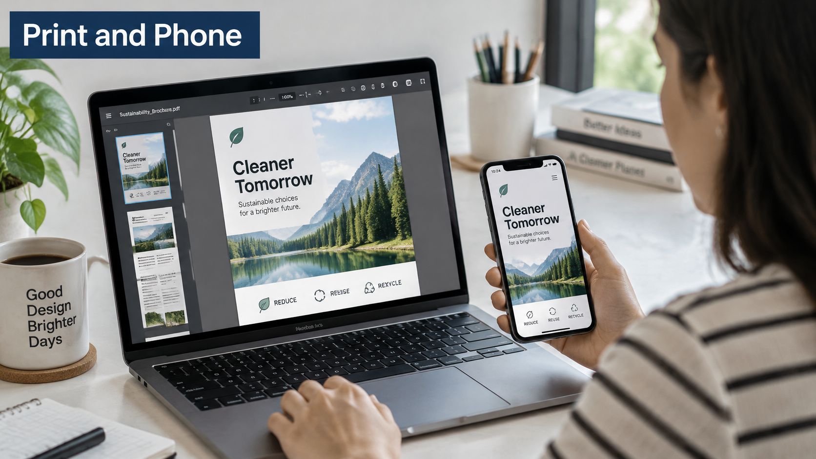
You don't have to sacrifice a strong designed edition to serve phone readers. Keep the print-ready PDF as the master for downloading, printing, proposals, and archives. Add a separate reading path for the phone, then label each option clearly so readers know what they're opening.
This dual approach works because structure can travel even when the layout changes. The World Wide Web Consortium guidance on tagged PDF explains that tags provide reliable recovery of text, graphics, and images without ambiguity about content or order. It also notes that properly structured PDFs can be reflowed to fit different display sizes. In plain terms, a tagged master gives a viewer or article extractor something coherent to rebuild.
Decide by Reading Task
A short proposal reviewed before a meeting may only need a viewer with effective reflow and a clear opening screen. A magazine or long report that readers move through article by article usually justifies responsive extraction. A pricing grid may need the designed table for comparison plus a short phone summary of the recommended option.
Answer four questions before committing:
- Who reads on phones: Are they scanning for one answer or reading start to finish?
- Does layout carry meaning: Would separating an infographic, chart, or grid weaken the message?
- How often does content change: Can your team update two editions without errors?
- Do you need measurement: Will analytics, personalization, or a tracked call to action change a business decision?
The trade-off is maintenance. Every correction must reach both paths, and someone must own that check. A tagged source reduces duplicate work, but it doesn't eliminate review.
Put the edition name on the cover, in the menu, and beside download buttons. Make switching a single tap. Readers shouldn't have to guess whether "View report" opens a responsive article or a page-sized file they intended to save for their desk.
Type, Page Size and Image Settings That Work on Phones
Start with body text because it determines whether anything else matters. For a phone-width layout, set body copy at 12 pt or larger. Print sizes around 9 pt or 10 pt become difficult once a full page is compressed into a narrow viewport, even on a sharp modern screen.
Typography Settings
Keep lines between 40 and 60 characters where you control the layout. Long lines force readers to track back accurately after each return, which gets harder while scrolling. Very short lines create a different problem, constant interruption, so avoid squeezing copy into narrow sidebars.
Use line spacing around 1.4 to 1.5 times the type size. Small bright screens make tight lines merge visually, especially outdoors or at reduced brightness. Headings should be at least 18 pt in a phone edition, with enough weight and space above them that a section break registers during a quick scroll. One clear font family with a few weights is easier to scan than several decorative faces.
Left-align body copy rather than justifying it. Justification can open uneven gaps in narrow columns and makes line tracking harder. Use bold sparingly for names, outcomes, and figures the reader may search for later.
Images and Page Construction
Export screen images at 150 ppi at displayed size. A 300 ppi print asset adds weight without a visible benefit on most phone pages, although detailed diagrams deserve a separate check after compression. Crop images to the area readers need instead of placing a large photograph and masking most of it.
Keep text as live text, not as part of a flattened image. Live text can reflow, scale cleanly, be searched, and be read aloud. If a chart must remain an image, place its conclusion in a caption and provide the key values nearby.
For phone-first publications, build a single-column version at phone width alongside the print master. That doesn't mean stripping out photography or brand color. It means giving each element one clear position in a vertical sequence instead of asking readers to interpret a miniature spread.
| Element | Print-style value | Phone-ready value |
|---|---|---|
| Body text | 9 to 10 pt | 12 pt or larger |
| Line length | 70 to 90 characters | 40 to 60 characters |
| Line spacing | 1.0 to 1.2 times type size | 1.4 to 1.5 times type size |
| Section headings | 12 to 14 pt | At least 18 pt |
| Image resolution | 300 ppi at print size | 150 ppi at displayed size |
| Layout width | A4 or Letter portrait | Single column at phone width |
| Touch targets | Not applicable | 44 x 44 pt on iOS or 48 x 48 dp on Android |
Export one representative page before applying the settings everywhere. Hold the phone at a normal reading distance, don't zoom, and read to the bottom. If you squint at captions or lose your place after scrolling, adjust the design values rather than blaming the device.
Navigation, Links and Buttons Readers Can Tap
The first screen should tell a busy reader what the document is, why it matters, and where to go next. Put the purpose in the title or opening copy, show one key proof point, make the contents visible, and offer one primary action. Four competing buttons on a cover usually means none of them has priority.
Navigation Readers Can Predict
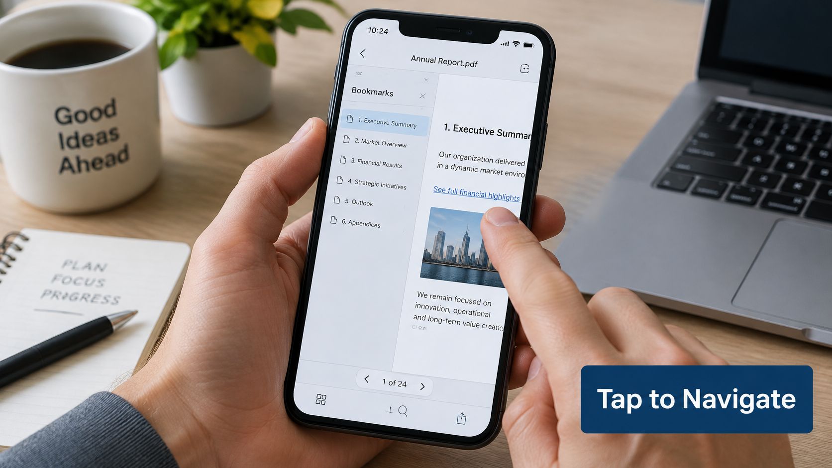
Generate bookmarks from real headings for every major section. Readers should be able to open a contents list, jump to a topic, and return without scrolling through unrelated pages. On long pages, add a visible link back to the contents or to the next logical section.
Descriptive link text does two jobs. "Read the pricing summary on page 6" tells sighted readers what will happen and gives screen reader users a meaningful destination. "Click here" and bare URLs do neither. If a link opens a download, form, video, or external page, say so in the label.
Interactive elements become easier to manage when they're created as interactive digital publications rather than flat artwork with invisible hot spots added later. Real link and button objects are easier to test, label, and keep in sequence.
Touch Targets and Sequence
Separate adjacent links so a thumb can hit one without triggering another. Small page numbers, footnote markers, and tightly packed contents entries are common failure points. Increase the active area, not just the visible text, and avoid controls that depend on hover, precise dragging, or keyboard-only input.
Reflow follows structure, not visual intuition. If a sidebar appears between paragraphs in the tag order, the phone version may interrupt the argument with an unrelated callout. Read the reflowed sequence from top to bottom and move supplementary material after the passage it supports.
A reader who can't find a section has a navigation problem. A reader who finds the control but can't tap it has an interaction problem. They need different fixes.
Finish by tapping every link and button on a real phone. Confirm the destination, orientation, and page position are correct. Pay special attention to links near tables and forms, where a small targeting error quickly becomes a reason to abandon the task.
Accessibility and Load Speed Limits to Check
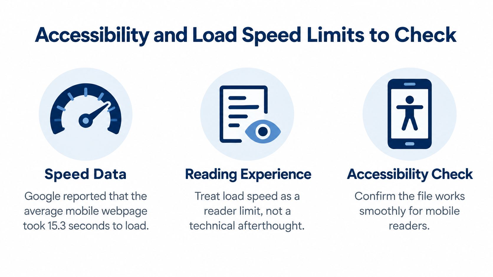
Speed isn't a cosmetic metric for mobile reading. In Google's mobile site speed research, the average mobile webpage took 15.3 seconds to load, and Google recommended 5 seconds or less on a 3G connection. The same research found that users who have a negative mobile experience are 62% less likely to purchase from that organization in the future.
Those figures describe webpages, so don't turn them into a false promise about every PDF. Use them as a discipline for testing. Time the complete path on a phone, including viewer startup, the first readable page, page turns, embedded fonts, image-heavy spreads, and interactive elements.
Show Useful Content First
Progressive loading beats making readers wait for a complete high-resolution publication. The opening page should expose readable text and navigation quickly while heavier pages load behind it. Resize images before export, remove unused embedded assets, and avoid placing video or large galleries where they delay the first meaningful screen.
Compression has limits. If charts turn fuzzy or product colors shift, you've traded one reading problem for another. Compare the compressed page against the master on the phone itself, not on a desktop preview.
Build for Readers Who Don't Use the Visual Layout
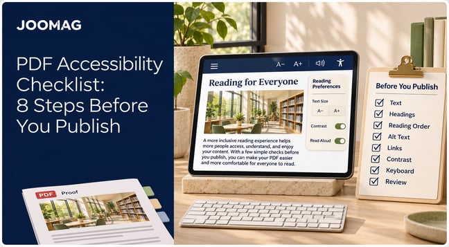
A reflow-ready file needs headings marked from H1 through H6, logical reading order, alt text for informative images, a declared language, and decorative items marked as artifacts. Link labels should identify their purpose, and form fields need visible, programmatically associated labels.
Check text at the phone's largest system size and at 200% zoom. Lines shouldn't overlap, buttons shouldn't disappear, and essential content shouldn't require sideways movement. Contrast also needs a real-world check under bright light, where pale gray captions often vanish.
An attractive publication can still exclude people if its structure is wrong. Measure two release numbers on each device, time to first useful content on a constrained connection and the count of critical reading-order or alt-text defects. Those measures tell you more than file size alone.
Run This Smartphone Checklist Before You Launch
Test on at least one iOS and one Android phone in portrait and horizontal orientations, with the largest system text size enabled. Joomag's Creative Studio lets users design, import PDFs, add interactive elements and adapt content for mobile, and content can be presented as standalone viewers, content hubs, website embeds and native mobile apps, so test the exact delivery format readers will receive.
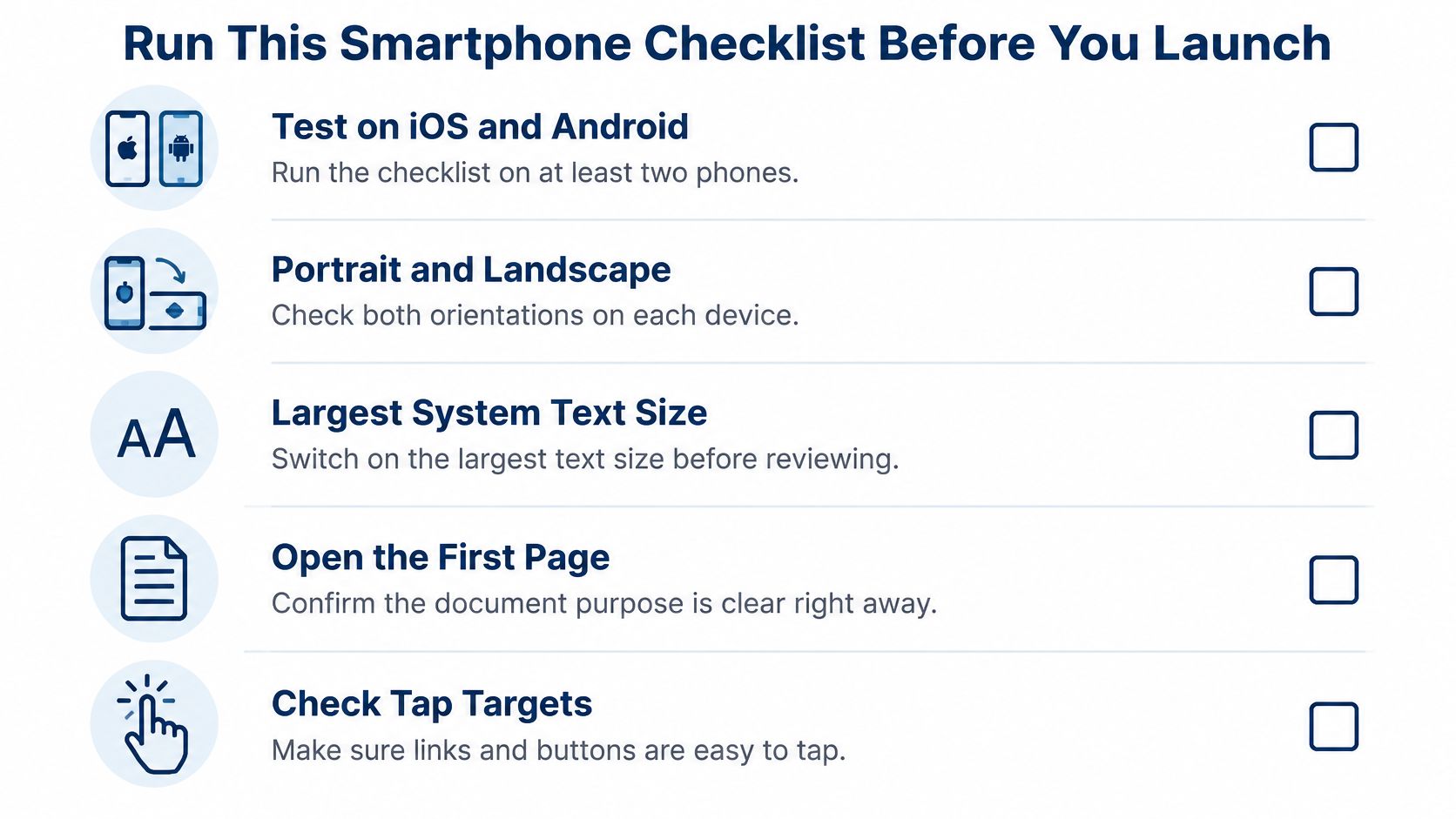
- Open the first page: Confirm purpose and next action without zooming.
- Read a full page: Finish body text without pinching.
- Use reflow: Check that columns become one logical sequence.
- Tap every control: Verify links, buttons, bookmarks, and jump links.
- Inspect wide content: Make sure tables and images remain understandable, with summaries where needed.
- Listen with a screen reader: Confirm headings, alt text, and link names.
- Check zoom and contrast: Review body text at 200% zoom.
- Time loading: Note first useful content and slow transitions on a constrained connection.
- Record pass or fail: Log results for every release.
The Adobe accessibility guidance and review figures cited with it show why assuming success is risky, one review of 20,000 papers reported that 74.9% failed every assessed accessibility criterion, and another review of 18,627 PDFs found 91% lacked tagged headings. Treat those as risk benchmarks, not predictions for your catalog. If the same failure recurs, repair the source tags and re-export. Block launch for critical reading-order or missing-alt-text defects.
Make Your PDF Mobile Friendly With Joomag
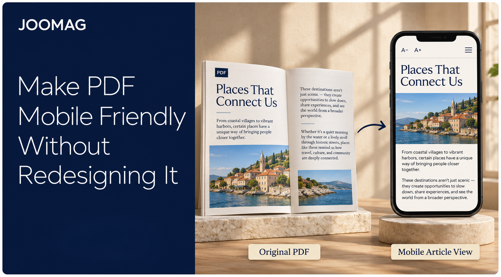
You don’t need to rebuild every spread to give phone readers a more comfortable experience. With Joomag, you can keep your designed PDF as the original edition and offer a mobile-friendly reading option alongside it.
Turn PDF Content Into Mobile-Friendly Articles
Joomag’s AI Article Extraction helps turn content from your PDF into responsive HTML articles. Instead of navigating miniature columns, readers can follow text and images in a scrolling layout that adapts to their screen. Each article has its own URL, making it easier to share a relevant section in a sales email or campaign.
Review the extracted content before publishing. Check headings, paragraph order, captions, images and links, especially where the original includes sidebars, tables or text continued across pages. Refine the content in Article Studio while retaining the designed publication for readers who prefer the original presentation.
Offer More Ways to Read With Accessibility Mode
Joomag’s Accessibility Mode provides an alternative text reading experience with controls for font size, spacing, contrast and theme. Include this reading option in your testing alongside the designed edition, checking navigation and content order against the original.
This gives your team a practical way to preserve the brochure, catalog or report it already approved while making its content easier to read on smaller screens. Review the published experience separately from the downloadable PDF, since improving one doesn’t automatically repair the other.
Test the Complete Reading Journey
Open the publication on a phone, switch between the available reading options and complete a real task: find a product specification, read a section or follow the main call to action. Check the hosted experience and the downloadable original before sharing the publication with your audience.
Keep Your PDF Design. Improve the Mobile Experience.
Your approved PDF can remain the designed edition while phone readers get a more flexible way to explore its content. Joomag brings interactive publishing, mobile-friendly articles and Accessibility Mode into the same workflow. Explore Joomag with one of your existing brochures, catalogs or reports, and see how readers can move from the opening page to the information they need.